Apple’s Big Sur: What Does it Offer?
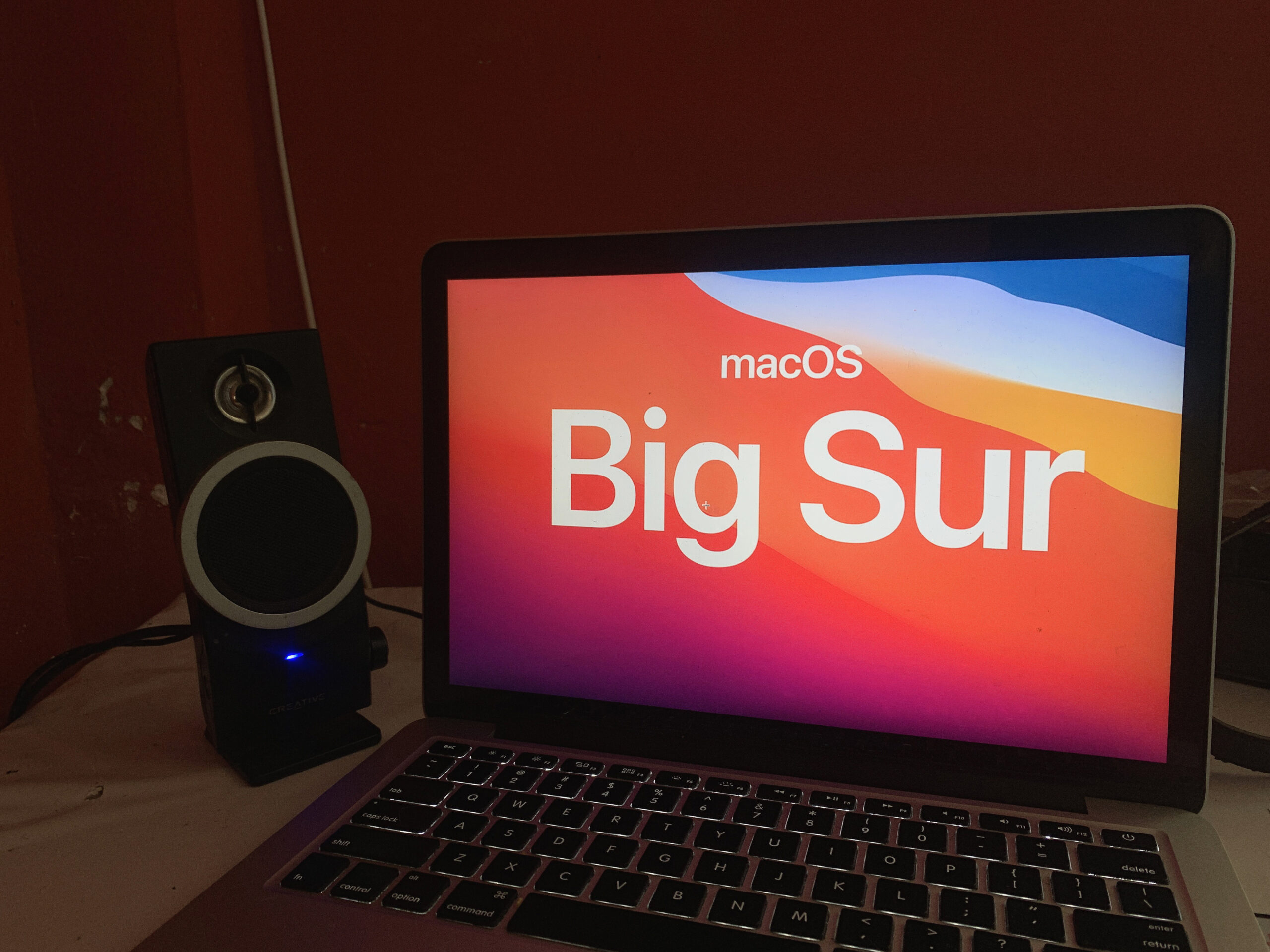
On November 12, Apple unveiled the final version of macOS Big Sur, and we all want to know what comes with it.
The compatibility of Big Sur goes far, so you don’t need a new Mac to upgrade to it. We are excited to enjoy its amazing new features (and an overhauled design, too), so in this post, we will discuss what’s new in this upgrade.
But first, probably the most significant upgrade by Apple is still coming – the new processor.
Apple has announced transitioning away from Intel processors to in-house designed ones, called Silicon-Valley chips. In particular, on November 10, 2020, the company presented its first Apple M1 chip. Apple pledged to switch all of its computers to the new processor next year.
Now, let’s take a look at the most striking Big Sur features.
An overhauled design
credit: neowin.net
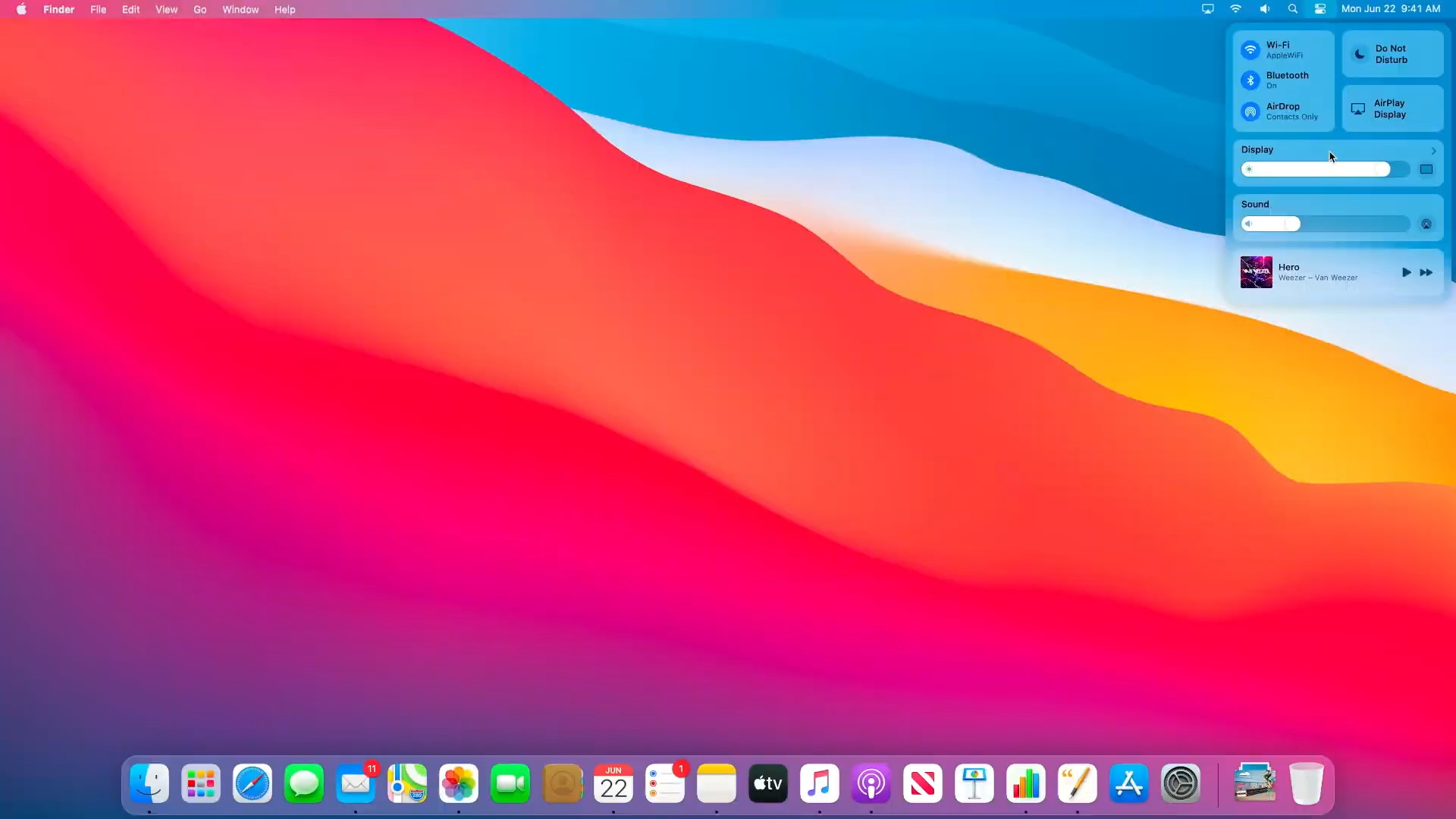
Corners. Apple redesigns the shape of all window’s corners from squares with subtle curves to squares with rounded edges. It looks sleeker that way, perfectly matching the Mac experience. The palette of shadows also becomes lighter and more transparent.
Icons. The design of icons promotes unification with iOS’s set of icons while retaining a typical macOS icon style. Moreover, developers work on adjusting the design of third-party applications.
Color. Apple is shifting towards the convergence with iOS and iPadOS design. That explains the unification of colors for these three platforms.
Cleanness. The new interface that appears when you save a document is a likeness of iOS’s share sheet, with its cleanness and prominent buttons. The top menu looks almost translucent, so that you can see your desktop.
All in all, the design team strived to streamline macOS and help it fit in better with your iOS and iPadOS experience.
Control Center
credit: hellotech.com
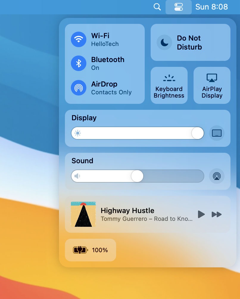
MacOS inherits Control Center from the iPhone. It becomes an essential and recognizable element of the entire ecosystem, quickly taking you to the useful features, such as Wi-Fi, Bluetooth, AirDrop, and others.
Moreover, you can now tailor CC to your tasting and return icons you need to the menu bar by dragging them from the CC. The menu works in the same way as iOS’s. You need to click to open particular sections. For example, upon clicking Display, modes will appear.
Notification Center
Apple optimizes the Notification Center to include all the information the user expects, including fully functional widgets. It displays notifications from your apps like Messages, Photos, Safari, Home, and more. Notifications are grouped by the application instead of the standard chronological order. It’s extendable, and many parameters are interactive.
Widgets
MacOS’s widgets aren’t new kids on the block, but users rarely paid them due attention. Big Sur overhauls the design of these elements, and now they look more like iOS’s.
To use a widget, you need to press Time in the menu bar, make a right swipe, or set up opening via active corners. Interestingly, the final Big Sur version loses the calculator widgets we could see in a beta version.
Application design
MacOS’s native applications got a brand new look, too. For one, their right column now resembles a toolbar. Take a look at Finder, Mail, and Home, and you will see it. Pay a visit to your Music and check out the color choice, playlists, and genres option in the search section.
Big Sur’s right-click menu has also undergone some alterations. The buttons are now more prominent. The same goes for warnings.
Overall, the new redesign looks even more modern while sticking to the backbone of our familiar interface. Obviously, Apple attempts to create a unified style for an entire ecosystem.
Safari
Of all the native apps, Safari has undergone the most significant change in Big Sur. Designers have made all browser elements larger, buttons became more expressive, and their visible borders are gone.
Safari now lets you preview tabs by hovering over the cursor. The preview will show where you are on the page exactly. You can also set a background on the start page and customize its elements to show your reading list, favorite websites, iCloud tabs, and more.
As part of the personal data safety effort, Safari now offers Privacy Report, a feature designed to detect and block all trackers collecting information about the user.
More importantly, Safari now keeps track of your passwords and tells you if any of them have been compromised. You can check them by opening your browser settings and going to the Passwords tab. Just look for the yellow icon next to an account. It shows that security advice is available for that account.
iMessage
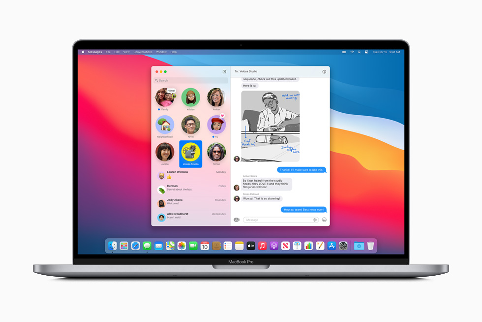
MacOS iMessage is now fully compatible with the iPhone’s. You can now use stickers and effects, pin chats and messages, and tag people.
credit: hellotech.com
Your group conversations are now synchronized with your iPad and iPhone. The Memoji sticker editor has appeared in iMessage for Mac, though for some, this function may seem redundant.
Battery
In Big Sur, “Energy Saver” becomes “Battery.” In this section, you can adjust the parameters to prolong your battery’s lifespan whether you work on a battery or AC adapter. Also, Battery contains Usage History, where you can find battery consumption stats. What is lacking is the list of apps that use the most energy.
Maps
credit: hellotech.com
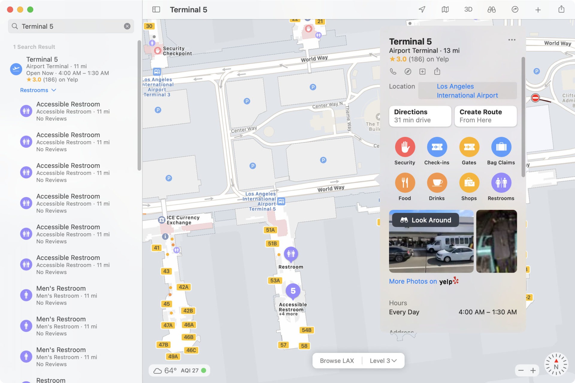
Big Sur brings in a new Maps design and functions, which are reminiscent of iOS’s. Now, Apple Maps will provide reliable guidelines to help you find the best places in the city. The information will be updated continuously, including by the users. You can also share it with family and friends.
Bicyclists will find it especially handy since Maps will show inclines on the route and how to get around them. If you own an electric car, you can use Maps to find the nearest charging stations. Also, in Apple Maps, you will be able to see crowded places.
Wrap up
- The most noticeable change of Big Sur is its overhauled design.
- macOS is moving towards unification with iOS and iPadOS.
- Safari is now faster and more secure.
- New widgets are handier than ever.
- Control Center allows quick access to your favorite amenities.
- Notification Center is more informative and streamlines the search.
- Apple Maps become as convenient as iOS’s.
Recommended articles

